One we love
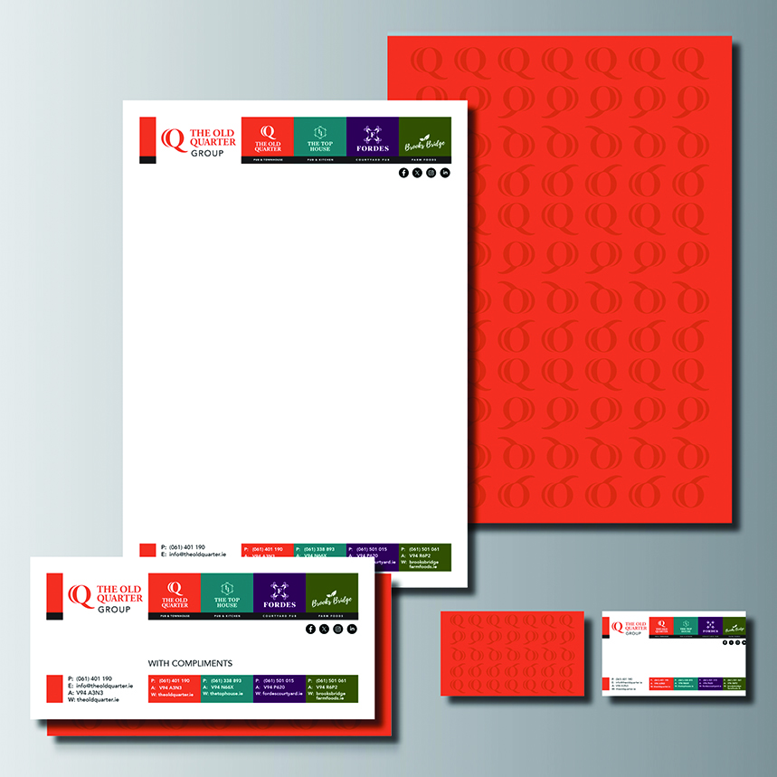
OQG Branded Stationery
If you think branded stationery is a thing of the past…think again! We created branded stationery for The Old Quarter Group. Some clear reasons why you should use your stationery suite (letterheads, business cards, envelopes, and more): It creates a consistent professional vibe, strengthens your brand identity, improves communication clarity and makes your business appear more reliable and established.
1. 83% of people can recall the brand, having received stationery.
2. 67% of SME businesses reportedly use branded stationery in significant numbers.
3. 57% of recipients of branded stationery report more favourable feelings toward the brand.
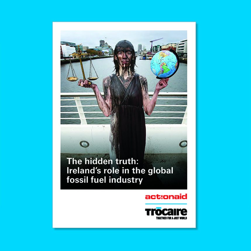
A Collaboration ActionAid and Trocaire
Trócaire and ActionAid Ireland’s climate report, ‘The hidden truth: Ireland’s role in the global fossil fuel industry’, shines a spotlight on the large-scale fossil fuel investment through Ireland. Important considerations for designing collaborative reports are to: 1. Follow brand guidelines for logo lock up 2. Clearly highlight the collaboration between the two organisations throughout the report 3. Choose a clear and legible typeface that is comparable to both collaborations 4. Establish common primary and secondary colours 5. Create a design feature that works throughout, as a subtle nod to the source of the report.
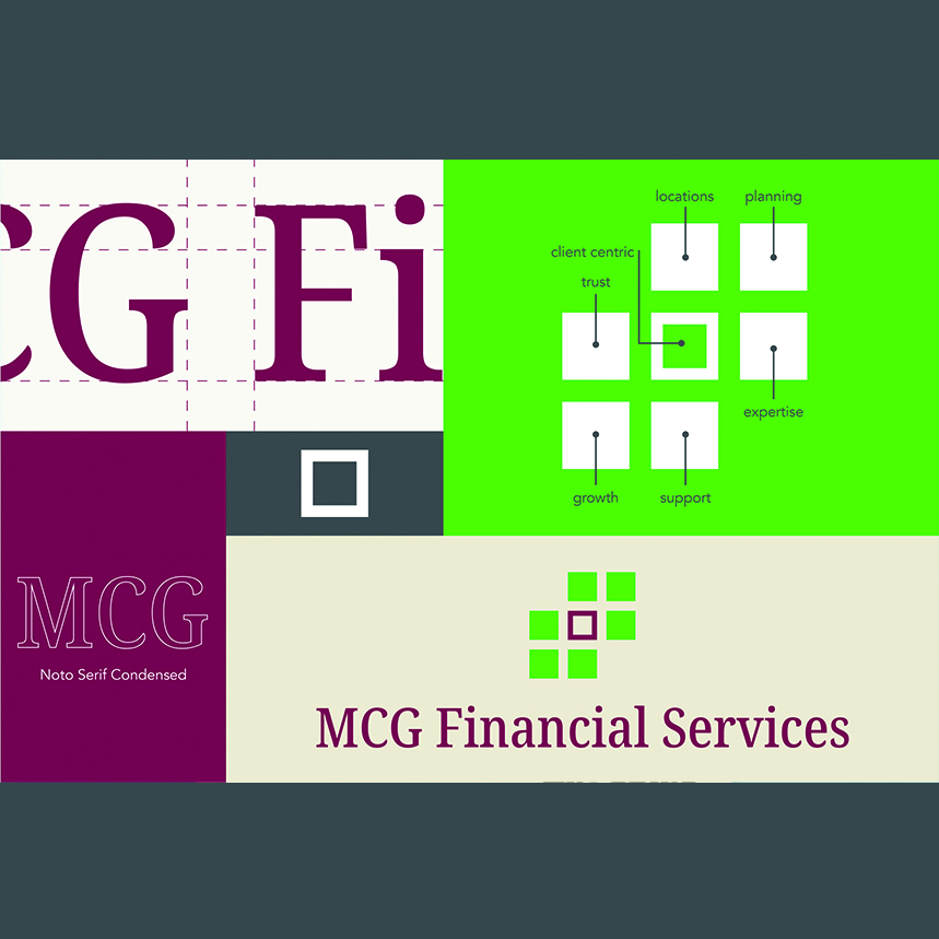
Rebrand
MCG Financial Services provide expert financial planning and bespoke financial solutions to their highly valued personal, business and agri clients throughout Ireland for over 40 years. This mark was inspired from the existing mark. The strong centre square represents MCG Financial Services and its client centric approach. The position of the six supporting squares suggests trust, planning, expertise, growth, support and locations. The shape represents structure and balance and symbolises relationships. A contemporary and engaging serif font has been carefully chosen to support the symbol. The mark is corporate, professional and contemporary.
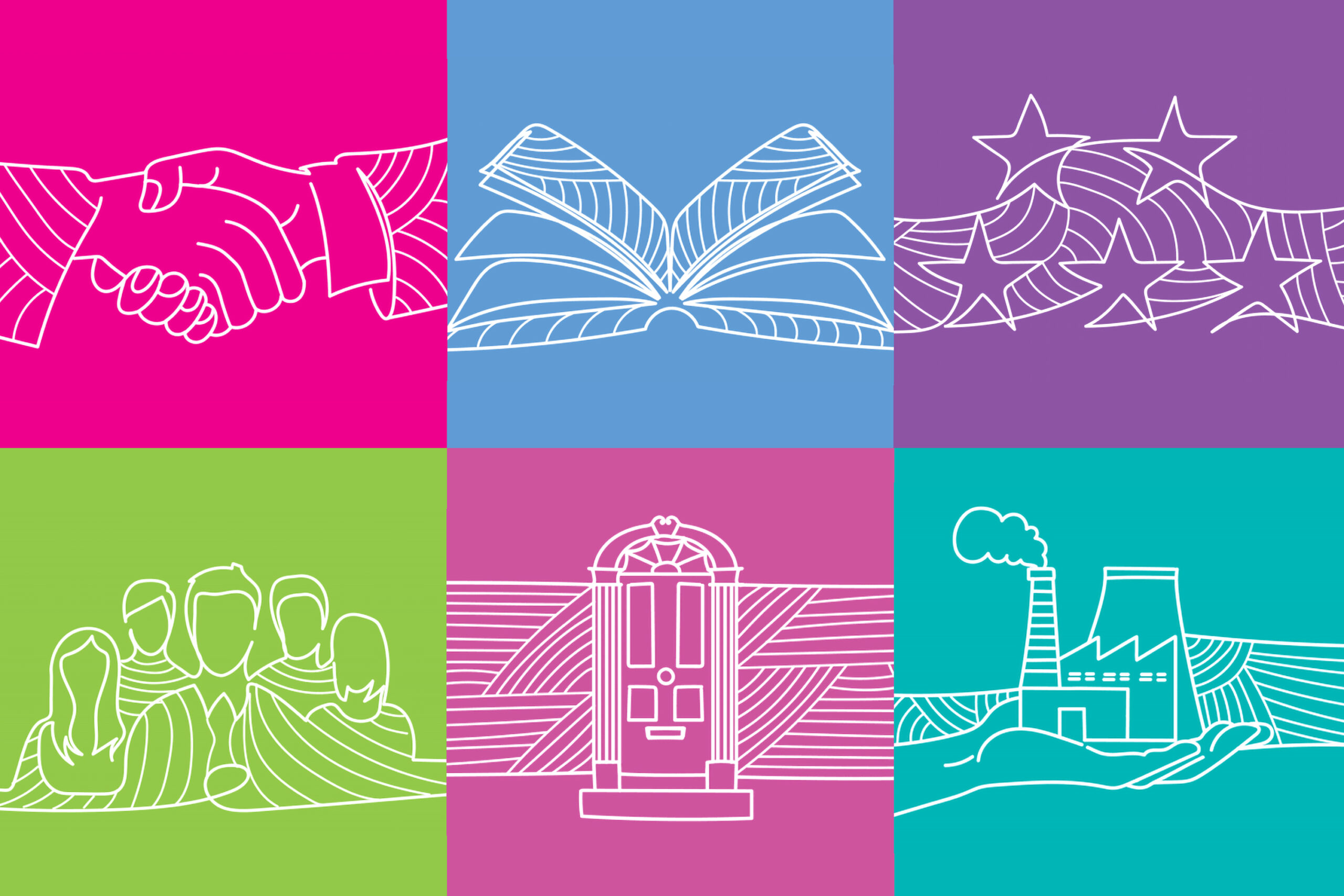
Illustration
Everlake are the expert financial planners with ethical conviction. We created a series of line illustrations to enhance Everlake’s communications. They are striking in their new, engaging secondary colour palette.
Retrospective
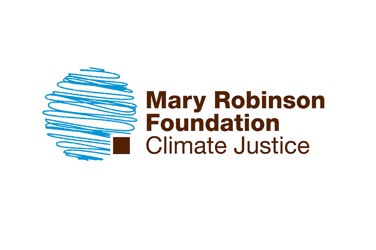
A centre for thought leadership, education and advocacy on the struggle to secure global justice for those people vulnerable to the impacts of climate change. The Foundation provides a space for facilitating action on climate justice to empower the poorest people and countries in their efforts to achieve sustainable and people-centred development. Bothwell & Vogel loved working with MRFCJ extensively over its 9 year lifespan, on building a brand that gained international recognition and respect. Design work included the creation of a logo that effectively communicated the work and aspirations of the Foundation. The free form illustrated planet communicates the possibility for change, the square represents the corner stone on which the Foundation would bring all of its activities together.
10 years
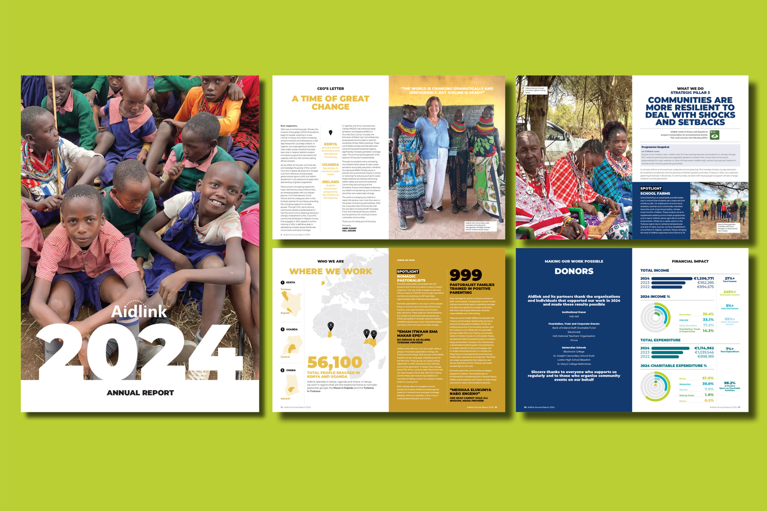
This year marks our ten-year journey with AIDLINK. This journey from client to friend began with trust. What starts as professional guidance, listening carefully, offering advice, and supporting decisions, gradually deepens as shared values, mutual respect and authentic conversations emerge. Over time, business meetings became more personal exchanges, milestones were celebrated together, and challenges were met with genuine care. The relationship evolves naturally, blending professional insight with heartfelt connection, proving that some of the strongest friendships grow from professional beginnings...thank you.
